


Cover Reveal: Thinking About Thinking
How a book cover is chosen

I’m excited to announce that my new book THINKING ABOUT THINKING will be published in a month by Abrams ComicArts.
You can pre-order signed, personalized copies from Watermark Books & Cafe (my fantastic neighborhood bookstore) and find it worldwide wherever books are sold.

It’s the fourth in my Incidental Comics series, which has touched on creativity (THE SHAPE OF IDEAS), bibliophilia (I WILL JUDGE YOU BY YOUR BOOKSHELF), and mindfulness (THE ART OF LIVING).
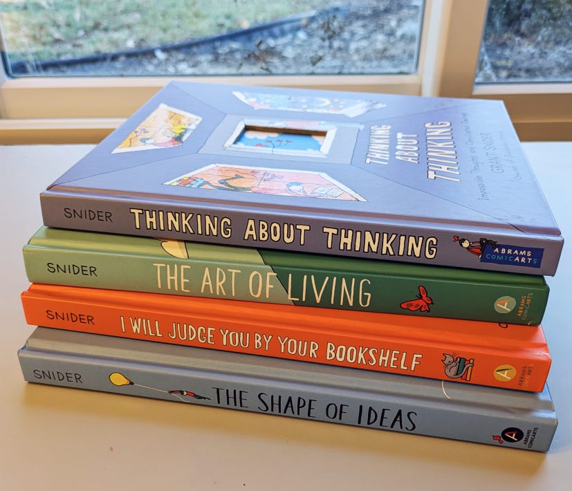
I’m just a red book and a yellow book away from making a rainbow…
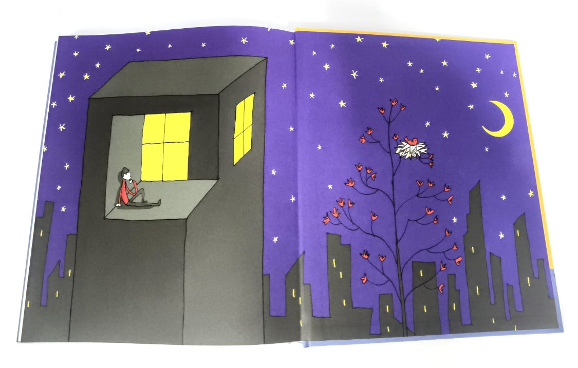
In THINKING ABOUT THINKING, I go deep inside my heart and brain, exploring impossible thoughts and complicated feelings in one and two-page technicolor comics. Here’s a peek inside:

Okay, one spread is enough—for now! I’ll share more as the publication date approaches.
Back to the most important part of the book: The Cover.
A cover is like a gig poster for the book: meant to attract the eye of a bookstore browser or library patron. A good cover shouts, “Hey, read this!”
Online the cover gets shrunk to the size of a postage stamp. But this bright speck of color should entice the reader to click on it and add it to their cart, forget they ordered it, and be pleasantly surprised when it shows up with the next delivery on their front porch.
Paradoxically, the cover is one of the last pieces to be created when I make a book. All the chapters are in order, every sentence has been copyedited with a fine-tooth comb (or whatever tool copyeditors use), and my author bio has been updated to include my latest exciting exploits.
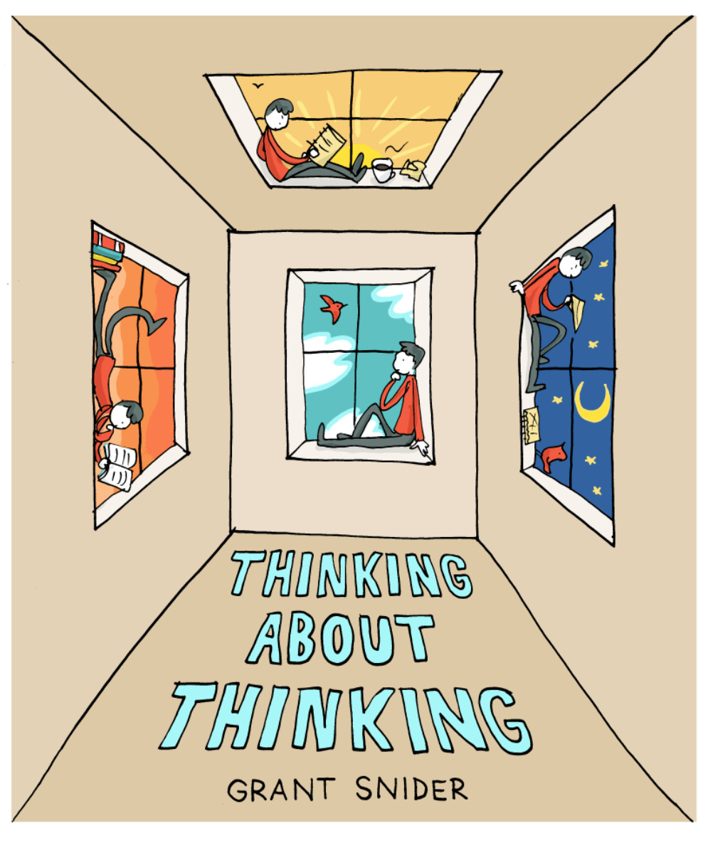
Now it’s time to get doodling. No pressure: it just needs to be a visually striking image that encompasses the book’s entire contents in one glance.
My initial sketches:

Too gloomy?

Too obvious?

Still too gloomy.
Too…beige?
But hey, that last one is interesting. And it’s always fun to riff on an existing piece of art. I was inspired by this piece by M.C. Escher:

Now what if we made it blue? Or orange? Or gray? Or another shade of beige?

Receiving a file like this from an illustrator is the kind of thing that drives art directors insane. I’m sure I’ve made every art director I’ve worked with question their career choice at some point in the process.
But I can’t help myself. I do it anyway.
Light purple emerged as the winning color. Go, Periwinkle! Or is that Cornflower? I’d ask my art director, but they’re no longer answering my emails…

I paid tribute to the feeling of overthinking on the book’s front and back endpapers.
Daytime frustrations…

Lead to nighttime insights.
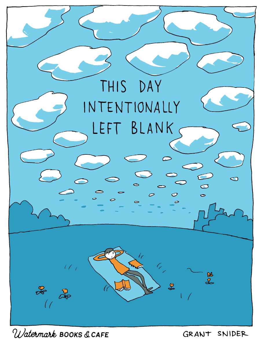
And even overthinkers need time to relax and clear their mind.
This page from THINKING ABOUT THINKING is also available as a limited edition tote if you pre-order from Watermark Books & Cafe.
I hope you get as much joy out of reading this book as I got out of making it.
May it lead you to daydreams, brainstorms, and feelings…and all the stages of thinking in between.
Loved reading and assessing with you at every step of this, Grant -- and a moment ago pre-ordered my hc copy here in Canada. Expect to grab a few more as birthdays roll by this year.
For me, the periwinkle cover tone is PERFECTION, especially with yr wink at Meneer M.C. Escher! (Cornflower is closer to true blue, eh...) Looking fwd to this upcoming gift from me to me for my 80th this weekend. ☺️
I can't wait to buy this book! I wish I was still an elementary school teacher, so I could share these with my students. I have so many ideas for lesson plans using your books!
Namaste, my friend